Google Search user interface: A/B testing shows security concerns remain
For the past few days, Google has been A/B testing some subtle visual changes to its user interface for the search results page. You may only get the new UI for certain types of searches or based on your current geolocation.
This test is not to be confused with (but could part of) a previously reported experiment by Google to add blue verified checkmarks beside business links that indicate the company is genuine.
We wanted to see how it may affect ads, and in particular if this change would help with the brand impersonation problem we have documented on this blog many times.
Despite a more simplified look and feel, threat actors are still able to use the official logo and website of the brand they are abusing. From a user’s point of view, such ads continue to be as misleading.
Small change to Google Search’s user interface
Like most software companies that want to better understand how their users react to changes, Google is running an A/B test on a new user interface for its search engine. The update so far is subtle, but some people are certainly noticing it.
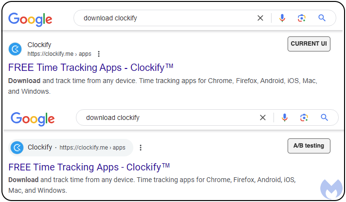
The new UI combines the ad title with its corresponding URL into a one-line greyed out shape. That URL is something important for end users as it allows to compare the search result with the official website for a brand, product, or service. In other words it is a little bit of a trust indicator.
The following image shows a Google search for the time tracking app Clockify in the current version of the UI and the new UI being tested:

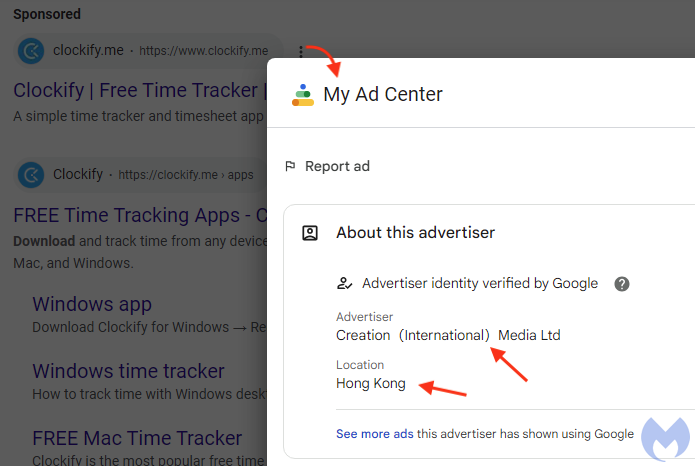
When it comes to ads (shown as Sponsored), the same UI changes apply. Note how the top result is an ad with the official URL https://www.clockify.me:

Under the hood
Clicking on the 3 dots next to the ad shown above brings up “My Ad Center” and we see a verified advertiser from Hong Kong. This account is not new to us, as we previously reported 4 malvertising incidents associated with it to Google.
But this is not a fake account, rather it looks compromised and is being abused by threat actors who are able to insert their own malicious ads whenever they are running a new malvertising campaign.

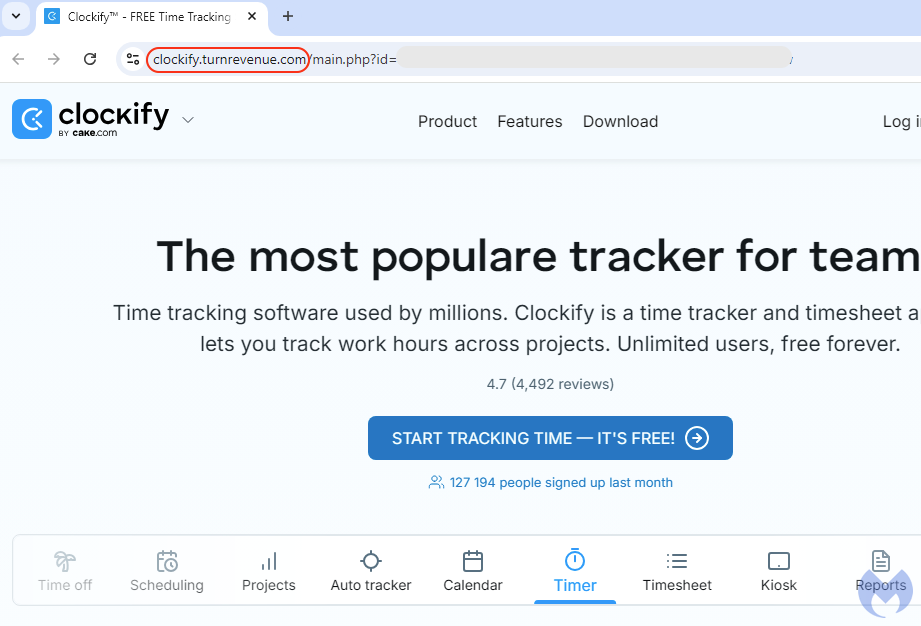
Clicking on the link takes us to a decoy website that looks and feels like the official Clockify:

Victims that click on the button to start tracking time end up downloading a malicious ClockifySetup.exe hosted on the same GitHub account we reported recently.
Indicators of Confidence
In the security industry, people often use the acronym “IOCs” for Indicators of Compromise. But, what users need the most are Indicators of Confidence.
Adding checkmarks next to search results is a good step forward to increasing online trust, but we have not seen this applied to ads yet. It also remains to be seen whether the checkmarks will actually work as intended. Some unnamed social media previously diluted their value by handing them to anyone willing to pay a small fee (something threat actors can easily do).
Beyond checkmarks, two of the most important visual indicators of safety are the logo and URL address seen in the ad snippet. This is what users will look at for a split second, before clicking on the link.
Google has the following choices:
- only assigning official logo and URL to genuine businesses that can prove they own or work with the brand name
- adding an additional checkmark on ads for genuine business associated with the brand
- adding an indicator of “non-confidence” to any ad using a trademark/copyright for which they have not proved they own
These ideas are a little tongue in cheek, as security is clearly not the only consideration at stake here with ads making for a substantial (as in $ billions) part of Google’s revenues.
We don’t just report on threats—we remove them
Cybersecurity risks should never spread beyond a headline. Keep threats off your devices by downloading Malwarebytes today.